UK Food Trends Visualization

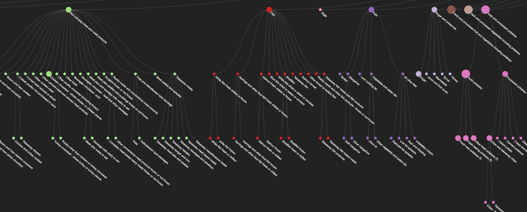
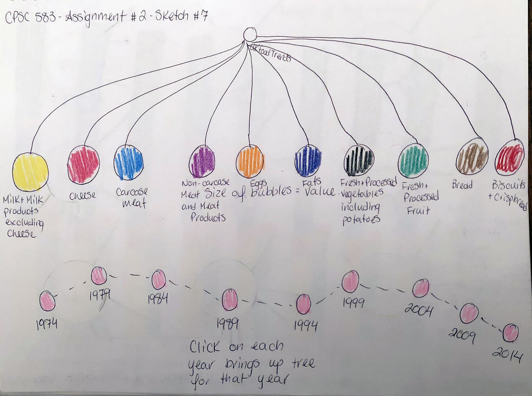
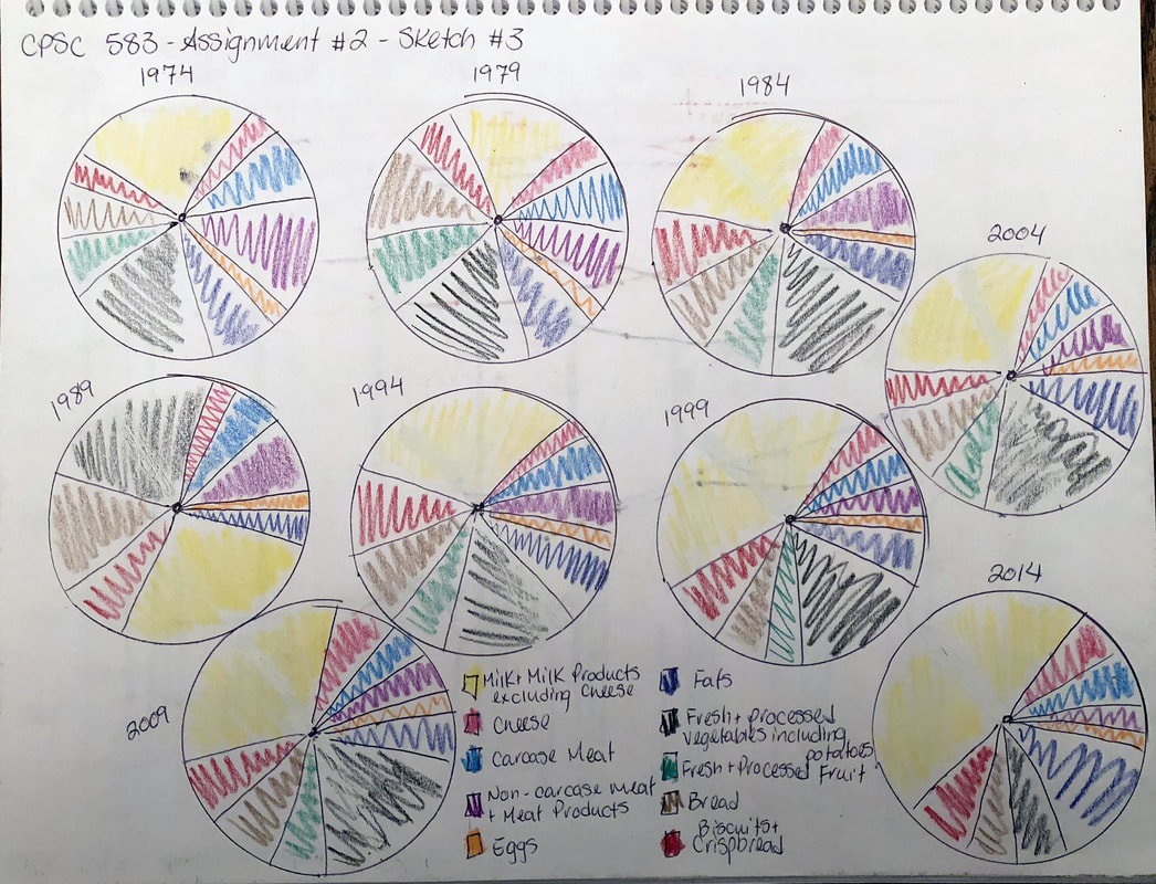
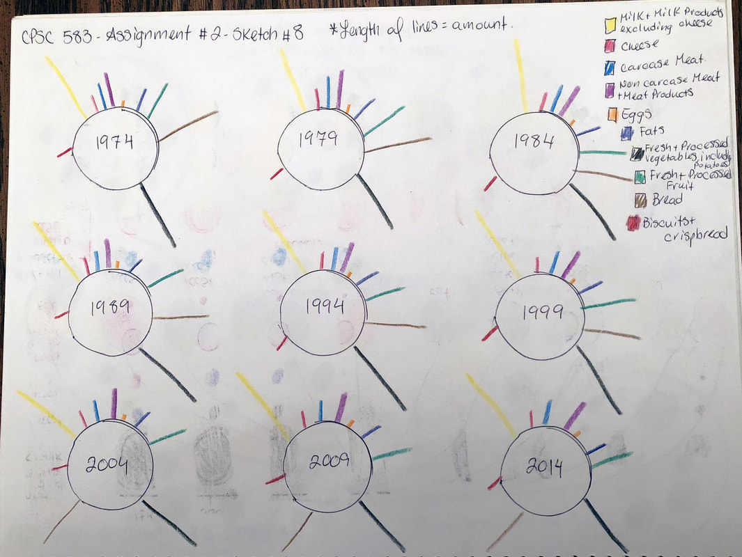
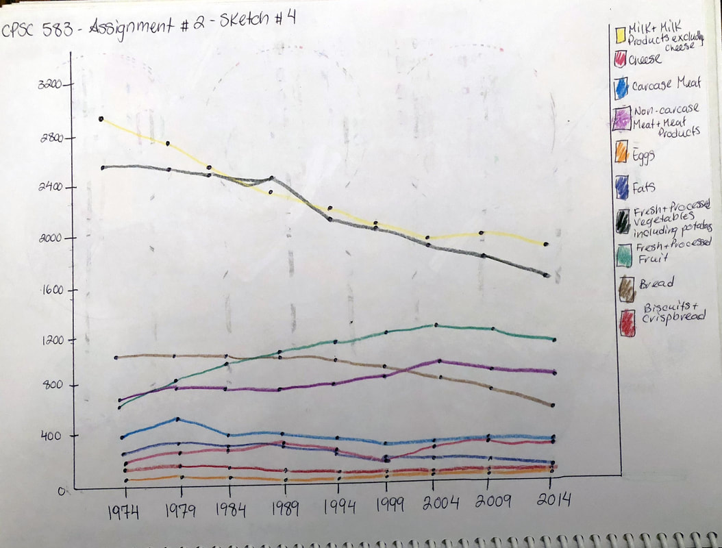
The data I used for this assignment was the UK Food Trends that we were provided with in class. It provides insight into the types of foods that are eaten in the UK and how much of these items were consumed each year, for 40 years from 1974 to 2014. It is useful to visualize this data because the data set is large and it is very difficult to see any trends or key features in the data, just by looking at the table. By visualizing the data, it is possible to see both good and bad trends in certain food groups, which can impact the health of individuals.
Detailed Sketches
|
|
|
|
|
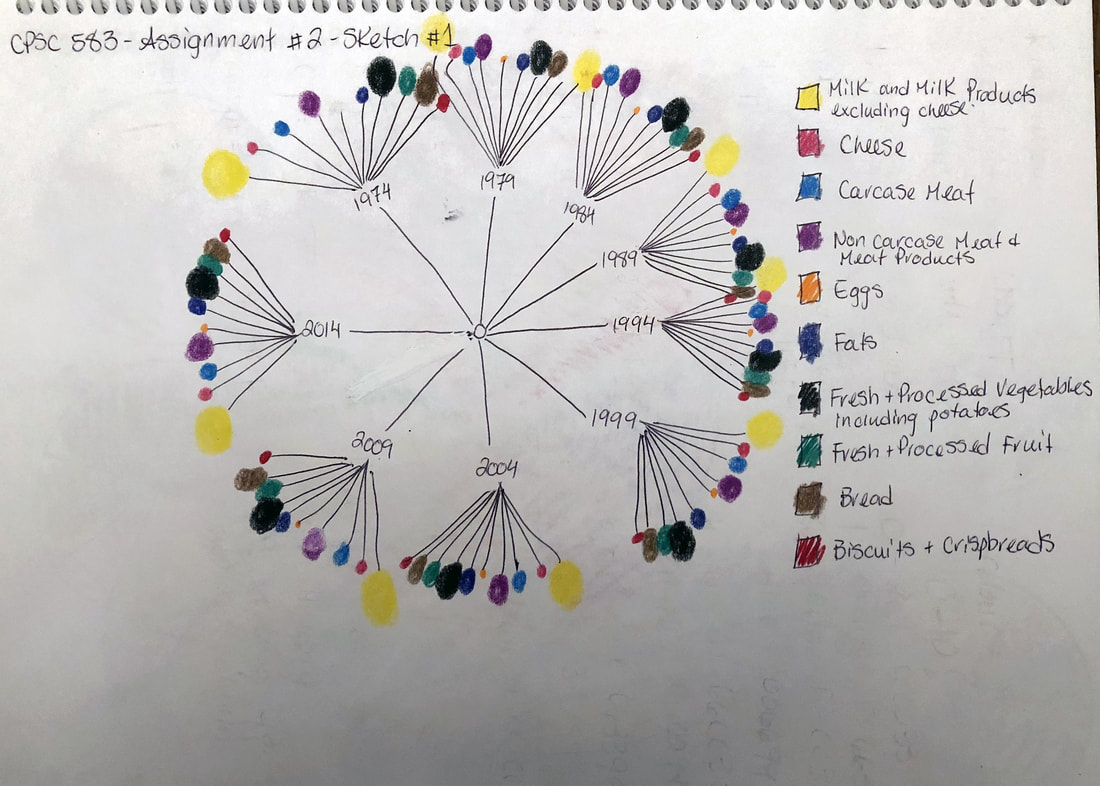
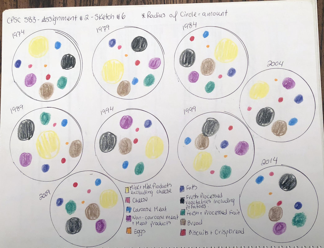
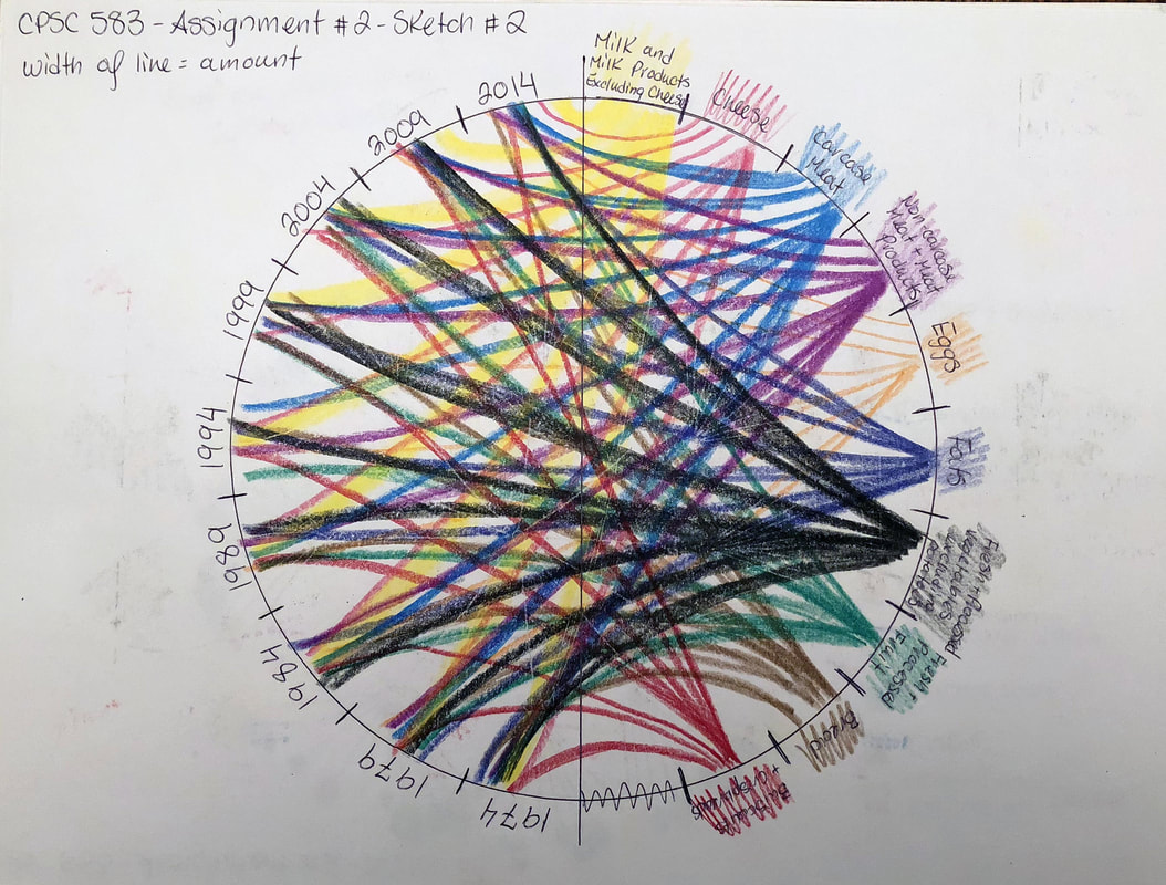
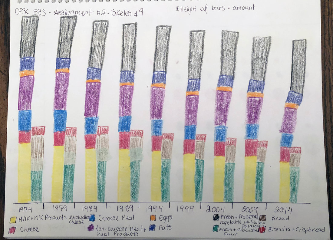
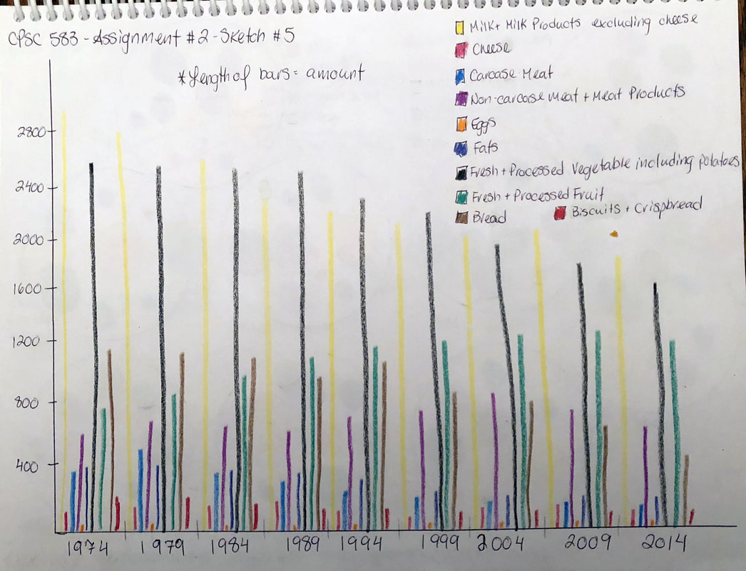
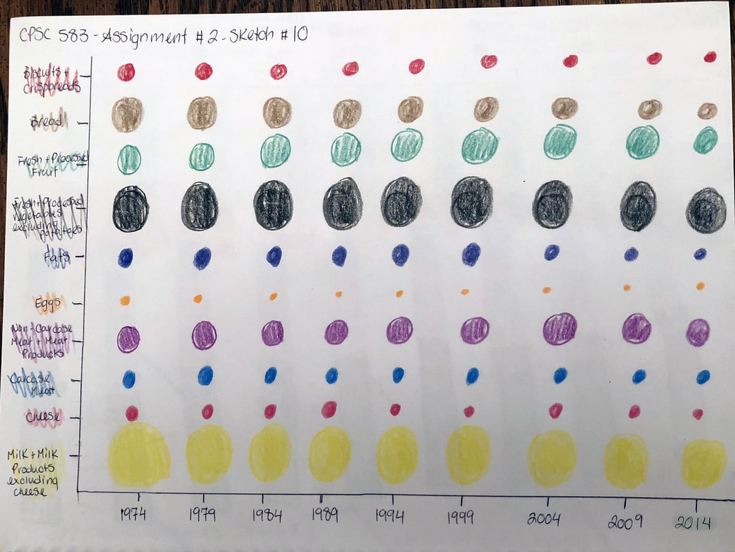
These are the 10 distinct sketches that I created for this assignment in order to gain insight into the data and how it could best be visualized.
Link to Running Code & Final Report
| cpsc583reporta2.docx |
Click on the link to access the running code I created for this visualization and/or download my final report.
