Cereal Obesity Poverty Visualization
|
|
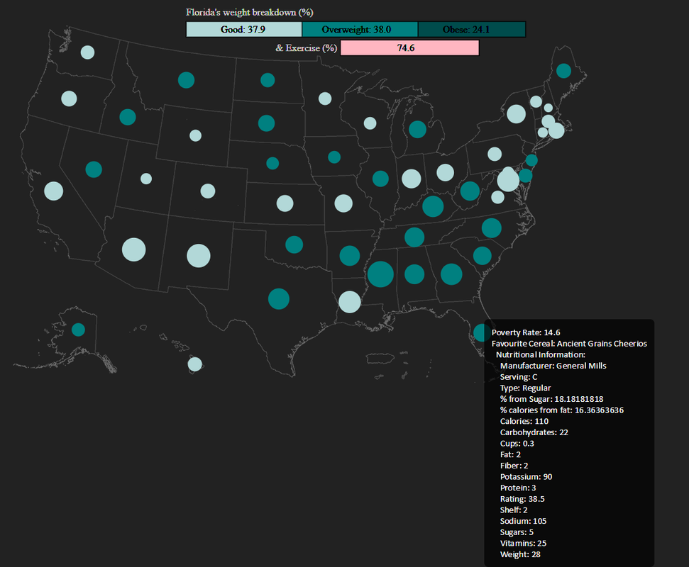
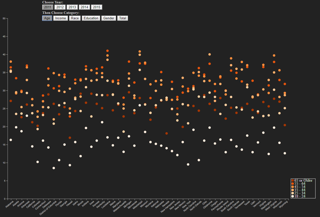
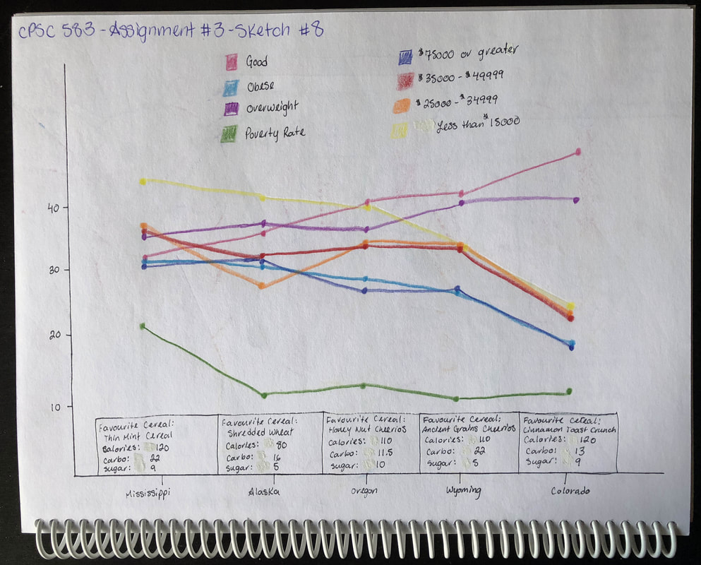
The data I used for this assignment was the Cereal Obesity Poverty excel file, which was provided in class. It provides insight into the obesity problems plaguing the United States, broken down into individual states. It is useful to visualize this data because it is a large data set that contains a lot of different trends that would be hard to identify by looking at it as a whole. By visualizing the data we can see if certain age ranges, income levels, races, education levels, or genders tend to be more obese than others and then try and determine a cause for it and figure out a solution. Also, by looking at their favorite types of cereals, this can give us insight into why some states may have a higher percentage of individuals that are overweight or obese than others. By creating this visualization, I learnt that although we think that sugary cereal would be large part of the obesity problem, there are some states that have a very sugary cereal as their favourite cereal, but their poverty rate is low and their population is mostly in the good weight category (Colorado as an example). So cereal must not be the only factor contributing to the obesity problem.
Detailed Sketches
|
|
|
|
|
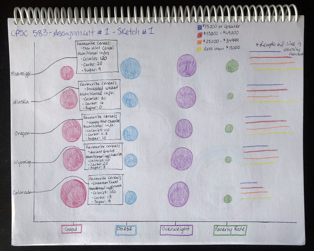
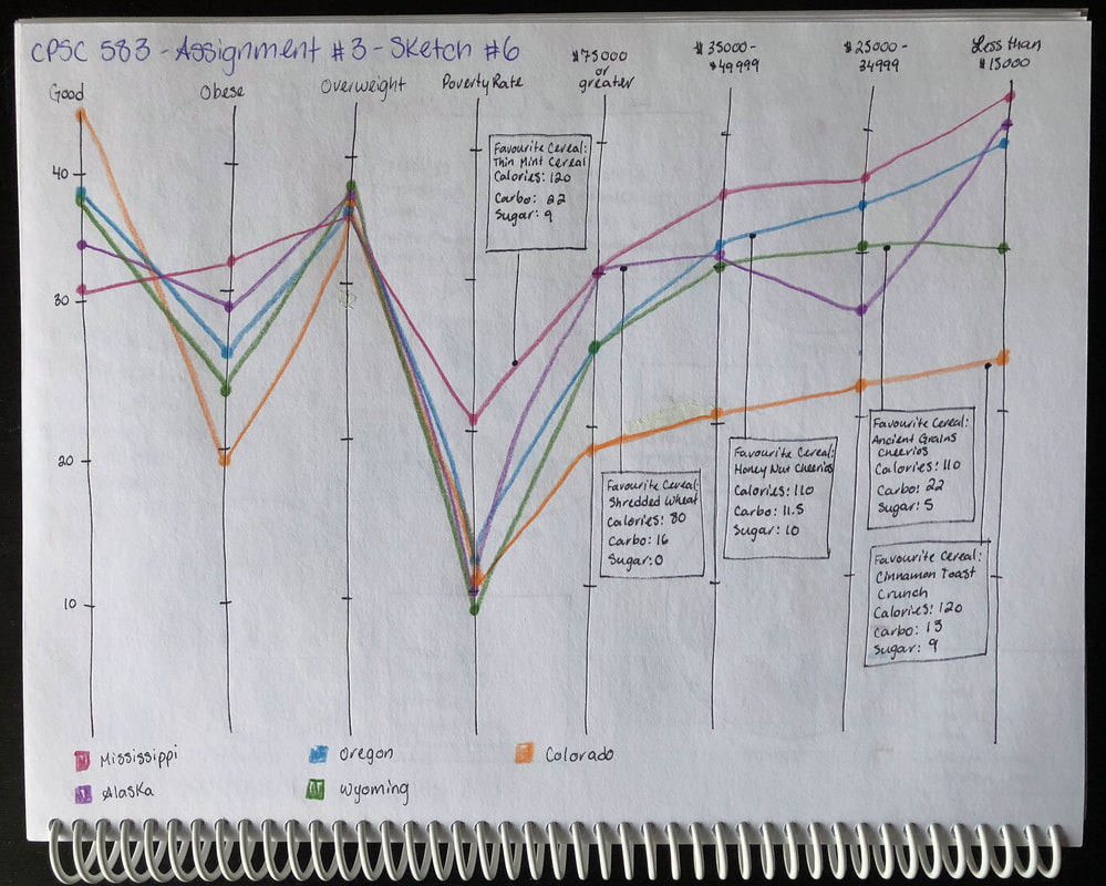
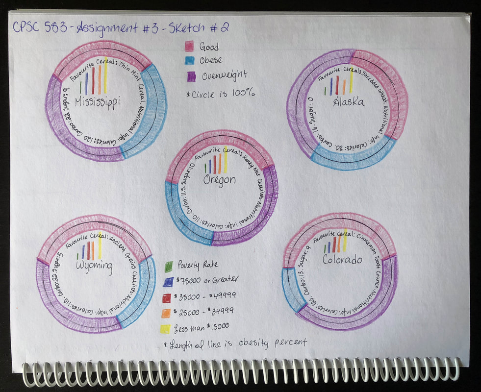
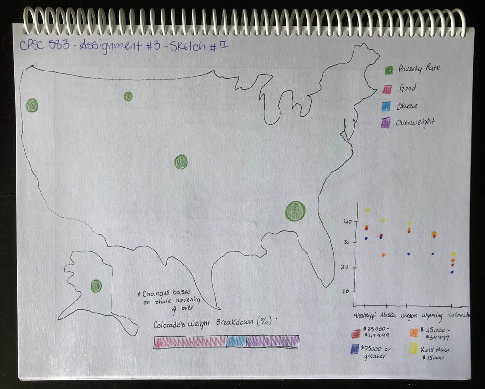
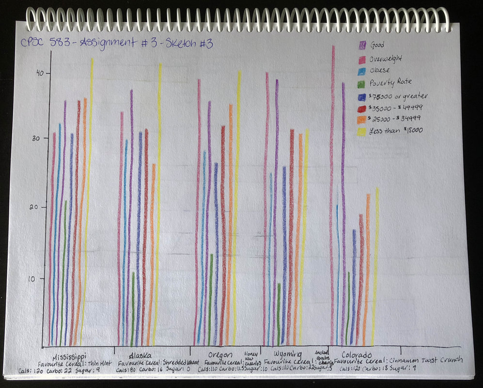
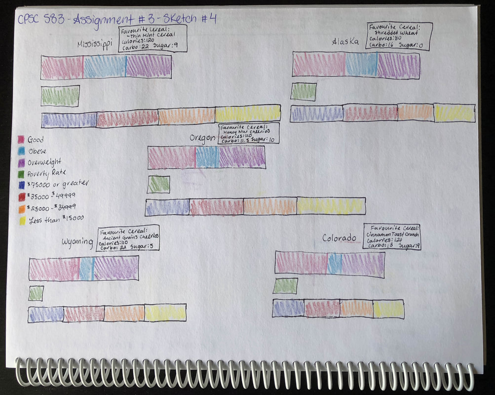
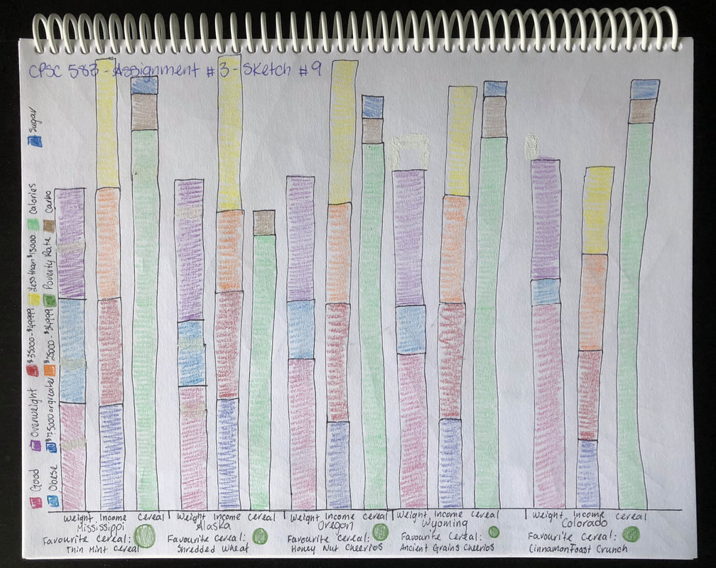
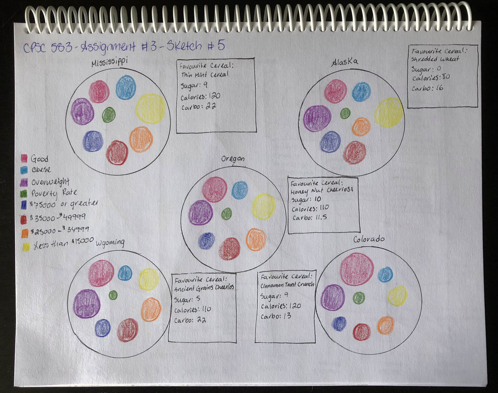
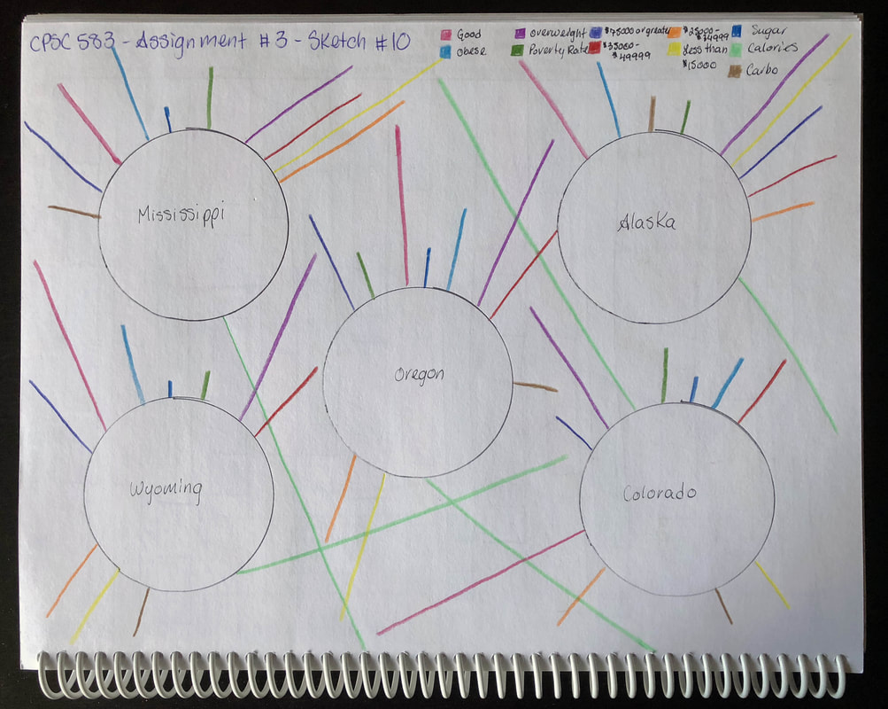
These are the 10 distinct sketches that I created for this assignment in order to gain insight into the data and how it could best be visualized.
Link to Running Code
| cpsc583a3report.docx |
Click on the link to access the running code I created for this visualization and/or download my final report.
