Video Prototype
Video Protoype Link
For our video prototype, we created a PowerPoint video of our system. The video starts with the user taking a photo of a wildflower they would like to identify. The photo is analyzed with our photo recognition software to find a match. Once a match is found the user is then able to pick up to three tasks, pinning the wildflower to a map for others to view where the wildflower was sighted, adding the wildflower to a photo journal, and learning more by viewing its detailed description and interesting facts.
(All wildflowers photos except the buffalo bean are from http://www.albertawow.com/wildflowers/alberta_wildflowers.htm#)
Storyboard
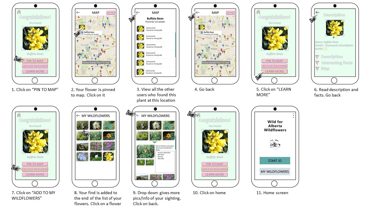
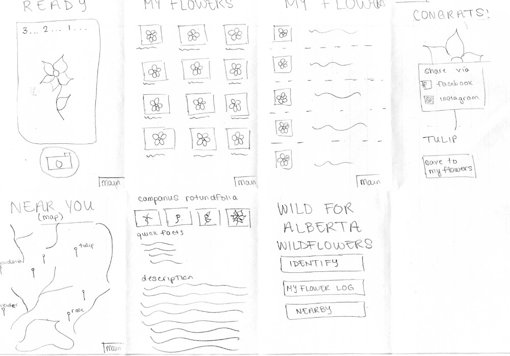
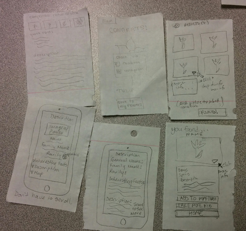
The storyboard showcases the three tasks the user can engage in once they have correctly identified a wildflower. ‘Pin to Map’ allows the user to pin their location to a global map (1-4). Clicking on a pin displays the pinned sightings of all users at that specific location. The ‘Learn More’ task (5-6) gives the user detailed information about their find. This is the traditional task associated with field guides. Lastly, the user can add their photo to their personal collection of sightings using ‘Add to My Wildflowers’ (7-9). Their photo is added to the end of the list. The user can then click on the photo, opening a drop-down page, where they can add/change a few more images of that wildflower and add notes. Pressing the ‘home’ icon brings the user back to the main screen (10-11). (All wildflowers photos except the buffalo bean are from http://www.albertawow.com/wildflowers/alberta_wildflowers.htm#)
Task-Centered System Walkthrough
For our Task-Centered System Walkthrough we used the task description below from P1 in order to walk through our video prototype and storyboard to determine any issues and possible fixes that could be made based on the task the user would like to be able to complete. The following walkthrough demonstrates a user identifying a flower, then learning more about it and saving it to their flower log.
"Brent is a tech savvy individual who enjoys being outdoors and learning about nature around him. He starts walking in Fish Creek Park and sees a flower that draws his attention. He wants to get out his field guide and determine the common name (doesn’t care about the scientific name), whether it is common or rare, if it is a native flower or if it was brought to this location by others, if it is invasive poisonous/harmful, any interesting facts or stories surrounding this flower (like corpse plant that doesn’t bloom annually and smells like rotting flesh). He would like to save an image of it with a date stamp, month, day, year, time and location and be able to share it to friends." After completing the walkthrough, we realized that many of the "knowledge low" issues were caused by buttons having an unclear function, or features being unintentionally hidden due to the lack of indicators. These issues would likely be solved by changing the text on the buttons to improve clarity, or adding labels where they did not previously exist. The "motivation low" issues were caused by the lack of a header menu for navigation (in the storyboard and video prototype, the user frequently relied on a back button to move to a previous screen). This issue could be fixed by including a header menu with navigation icons so the user doesn't have to put as much effort into finding their way around the system.
Brainstorm and Affinity Diagram
We had one brainstorming/affinity diagramming combined session that lasted an hour. This was done by individually sketching ideas onto a sheet of paper. Then each taking turns to discuss their sketches. Centering our ideas around the results of our investigation in P1 helped to focus the discussion. We talked about the similarities and differences between the ideas, and which ones we thought we would like to explore more. Then we grouped the like sketches together for an affinity diagram. The session was productive but we could have benefitted from at least another session. At the end of the session, we honed in on a few key ideas.
Brainstorming Session: Each group member came up with 7-8 sketches of various aspects of the system. The following are scans of each group member's brainstorming sketches (1 page per group member).
Affinity Diagramming Session: Each member cut their single sheet of paper to separate the 7-8 ideas that they had sketched. All the sketches were of screens at various points throughout the user's interaction with the system. We organized the sketches into four groups: main menu, identification techniques, journal/log/history, and individual flower descriptions after identification.

The following are closeup images of each group:
- Main Menu: This group contains sketches regarding what the welcome screen might look like, and any personalization options. These are the first screens a user would see when opening the app for the first time.
- Identification techniques: This group contains sketches regarding the way a user would input information about the wildflower they want to identify.
- Log/history: This group contains sketches regarding how a user's history of flowers found might be stored and displayed, as well as the history of their geographic area.
- Info after identifying: This group contains sketches regarding the way flower descriptons would be presented to the user after identifying a flower.
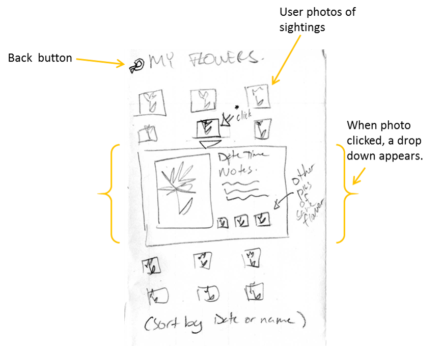
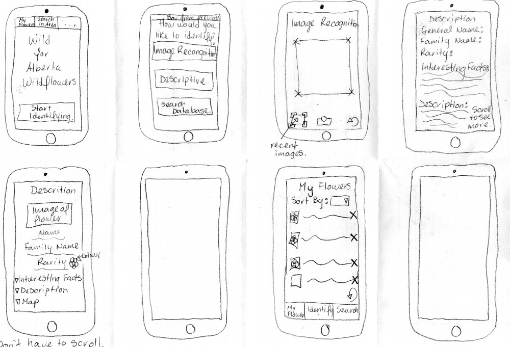
Many of the current apps do not have the option of taking and storing your own photos of wildflower sightings. Our researched showed that there is an interest in this type of feature. For our idea, once a user has identified a wildflower, they can store their photo in a photo journal. The sketch illustrates that when a photo is clicked a drop-down page appears. The page has the date, time, name of the flower, and space for notes. It has a button that takes you to the flower description page (not shown). It also has space for a few secondary photos of that plant (there is a limit of how many secondary photos). The user has the option of setting any photo as the primary photo. The photos can be saved onto the phone's storage or shared on social media.
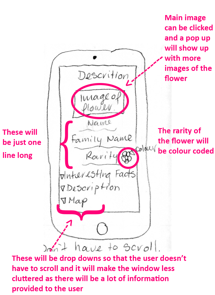
Based on our research done in P1 we found that potential users of a field guide app would like a description page that is organized and not very cluttered. For this reason, we decided that the most important information like the name of the flower should be available to the user right as they access the description page. Other more detailed information should be easily accessible by the user if they wish to learn more about the flower. This includes the full description, any interesting information about it and access to the map which shows the users locations of where to find the flower based on other users’ sightings and their own. In our research, we discovered that some users are not interested in all the facts about the flower and are just interested in knowing what it is, where to find it and the interesting facts about it, while other would like the more detailed description. In designing this page, we decided that drop down menus would allow users to be able to access the information if they desired. Also, we decided under the main image that the user should be able to swipe through the images again to keep the page organized and easily usable.
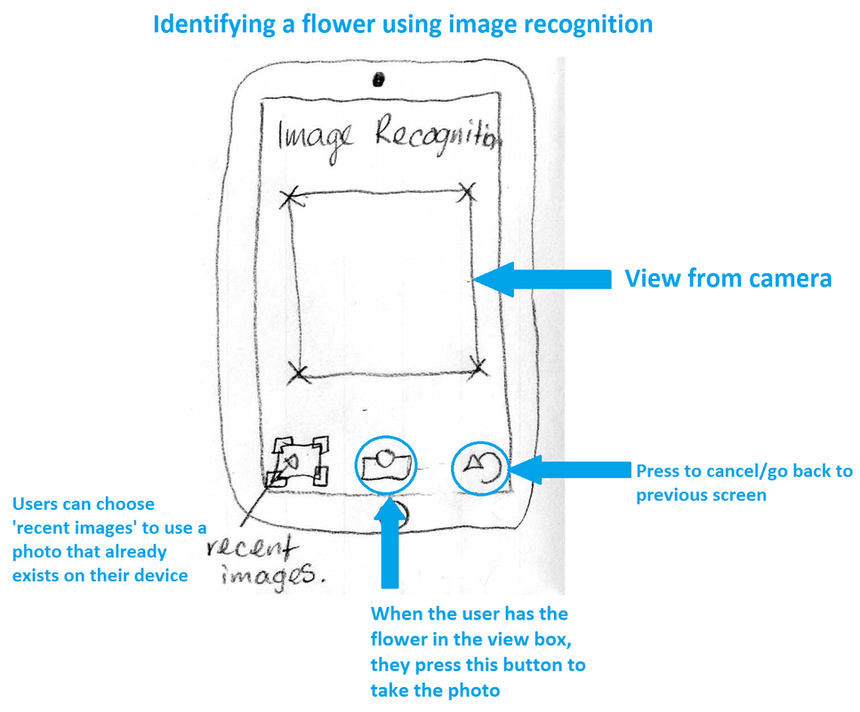
This is the screen that the user sees when they want to identify their wildflower using image recognition. If they want to use their camera to take a new photo, a distinct box indicates the frame in which the user should position their view of the flower before pressing the ready button. Users also have the option to go to their Gallery/Camera Roll to use an image that they took before.
From the above ideas, we chose to create a storyboard and prototype from idea 2 (exploring wildflower information after being identified) because it is one of the most prominent features of our system. We wanted to elaborate on what the user would be able to do after identifying a flower, as well as organize how these aspects of the system would be displayed.
Reflection
Having just one brainstorming/affinity diagramming session did not provide adequate time for several iterations to refine our ideas. Although the session was very helpful in generating different types of ideas, we could not explore many different creative avenues. This whole process helped us recognize the different visions that each group member had for different aspects of the system.
We used PowerPoint to create our storyboard and subsequent low-fidelity prototype. The storyboard came together easily because we produced fairly complete tasks from the brainstorming session. We concentrated on the steps involved after a correct identification of a wildflower as this gave us a range of steps to explore instead of just the one wildflower identification task. Even though the identification is one of the most prominent features of our system, we felt it was too short a task to use alone for a detailed demonstration of the system.
Initially we wanted a paper prototype, but PowerPoint was a better choice given our individual schedule constraints. PowerPoint also allowed us to easily add animations and transitions to the views of our system that improved the clarity of the task being demonstrated. It also improved the fluidity of the video prototype. We ran into a few issues along the way with playing the slideshow on mobile device, attempting to add a recorded video, and bugs with transitions/animations. While the PowerPoint made it easier/faster to do animations and transitions, we most likely could have sufficiently demonstrated the functionality of our system without these aesthetic features.
The task-centred system design walkthrough was a great way to closely examine every step of the user's interaction with the system and notice the issues early enough to fix them. The biggest struggle we faced doing the walkthrough was that we were already familiar with the system. We knew what every button did and what we needed to do without any instruction. This made it difficult at times to get into the mind of the user to understand how they would feel at each step and imagine which parts might be confusing to them.
